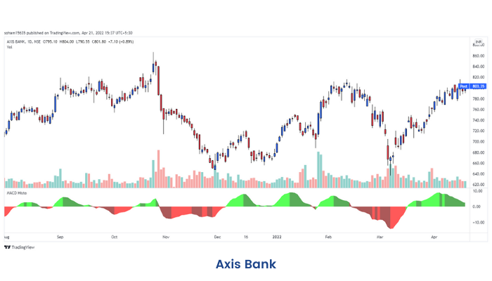
MACD Histogram
Earlier units, we have learned the concept of divergence and MACD indicator. Moreover, there is another theory related to MACD, i.e., MACD histogram.
What is a MACD Histogram?
MACD Histogram was developed in 1986 by Thomas Aspray. It bridges the time gap between the price movement and MACD. It also offers a deeper insight into the balance of power between so-called bulls and bears than the original MACD.
Histogram is one of the best tools available to a chartist because it shows not only who has control over the market but also their magnitude of strength and provides a MACD trading strategy that works. It measures the distance between MACD and its Signal Line which is the 9-day EMA of MACD.
MACD Histogram = MACD Line – Signal Line
The difference is represented by vertical lines or as bars in a series. The interesting fact is that like MACD, MACD-Histogram also fluctuates above and below the zero line. Hence, it is also known as an “oscillator".
If the fast line is above the slow line, MACD-Histogram is positive and plotted above the zero line. On the other hand, if the fast line is below the slow line, MACD-Histogram is negative and plotted below the zero line. Interestingly when the two lines touch, MACD Histogram equals zero. The magnitude of height is directly proportional to the spread between the MACD and Signal Line.


